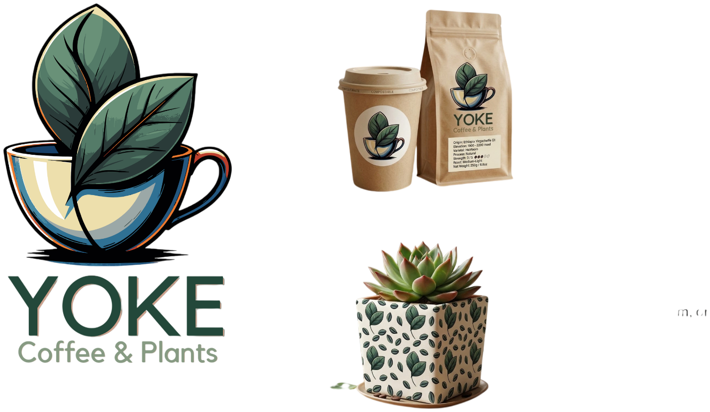

A logo is a single graphic symbol that serves as a visual identifier, whereas a brand identity is the comprehensive system of visual and verbal elements used to represent your business. Understanding the distinction between a logo vs brand identity is essential for small businesses to build a cohesive presence that ensures memorability, flexibility, and credibility.
Many small business owners invest heavily in a striking logo only to find that their marketing still feels fragmented, unprofessional, or stagnant. This common frustration stems from a fundamental misunderstanding of the difference between a standalone graphic and a comprehensive brand system. While a logo serves as your signature, a strategic brand identity provides the entire visual language, voice, and structure required to convert a casual browser into a loyal client. Without this cohesion, your business lacks the authority to compete in a saturated market. In this guide, we will explore the critical 3, 7, 27 rule for building trust; define the five pillars of a strategic identity; and identify the specific visual assets that actually drive revenue. You will learn how to evaluate your current branding to determine if it is truly supporting your business growth or quietly holding your vision back.
The Great Misconception: Understanding Logo vs Brand Identity

The core of the confusion lies in scope. A logo is one asset, but a brand identity is the entire world that asset lives in. Think of your logo as a signature and your brand identity as the handwriting, the paper, the ink, and the tone of voice that make that signature meaningful. When a business treats these two as interchangeable, it ends up with a striking mark that floats in a vacuum, unsupported by the colour, language, and imagery required to make it resonate.
A common trap is treating the logo as the finish line rather than the starting point. A brand identity is what gives that single mark a team to work with: a consistent colour palette, a recognisable photography style, and a voice that sounds like you. Together, these quiet elements do the heavy lifting a logo simply cannot do on its own.

Building this depth is essential because trust is not earned in a single interaction. In marketing, the 3 7 27 rule serves as a roadmap for the customer journey. This principle suggests that a potential client needs to see your brand three times to recognize it. By the seventh exposure, they truly begin to notice your presence in a crowded marketplace. However, it takes a staggering twenty seven touchpoints before a customer feels a sense of trust strong enough to make a purchase.
When visuals are inconsistent, you effectively reset this clock every time a customer encounters your business. Using a specific, elegant font on an Instagram post but switching to a generic template for your business card creates a cognitive disconnect. The human brain fails to link these two experiences to the same entity. Instead of building momentum toward that twenty seventh interaction, you are perpetually stuck in a cycle of first impressions.
Investing in a cohesive brand identity design for small business ensures that every touchpoint counts. Whether a client is viewing a digital PDF or visiting your studio in person, the visual cues remain stable. This discipline allows each interaction to stack on top of the previous one, building the credibility needed to turn a stranger into a loyal client. When your past brand identity projects follow a rigorous system, you move from a fragmented presence to a professional, trustworthy authority.
The 5 Pillars of a Strategic Brand Identity
Achieving the level of trust required for long term success involves more than a series of aesthetic choices; it requires a strategic framework. To build a comprehensive brand identity design, five specific pillars must work in unison. These pillars act as the foundational DNA of the business, ensuring that the brand remains recognizable regardless of the medium or the platform.
Core Purpose: This is the fundamental 'why' behind your existence. It defines the problem you solve and the specific reason your business exists beyond the products you sell.
Visual System: This includes the logo, a curated color palette, and specific typography. In the ongoing discussion of logo vs brand identity, the visual system serves as the tangible toolkit that brings the abstract brand to life.
Voice and Tone: This dictates how your brand communicates with the world. It determines if your messaging is authoritative and professional or relaxed and community focused.
Photography Style: Within our multidisciplinary creative services, photography is an essential pillar. It involves a consistent art direction that captures the specific mood of the brand, moving away from generic imagery to something that feels proprietary and authentic.
Cultural Values: These are the deep seated beliefs that drive your business decisions. They allow you to connect with your audience on a human level through shared principles.
When these five pillars are clearly defined, the brand gains the ability to scale and adapt to any environment. A strategic identity ensures your business looks as intentional on a physical shopfront in Hervey Bay as it does on a digital product mockup or an e-commerce platform. By examining past brand identity projects, you can see how these pillars prevent a brand from becoming a static, fragile image. Instead, they create a flexible system. This structure provides the necessary boundaries for a business to grow without losing its essence, ensuring every new brochure, social media post, or storefront sign feels like a deliberate part of a singular, coherent story.
Beyond the Icon: The Pieces That Actually Matter
A strategic toolkit moves past a singular mark to provide the specific assets required for daily operations. In a comprehensive brand identity design, typography serves as the brand’s handwriting. Selecting a typeface is a deliberate choice that dictates personality; a bold, geometric sans-serif communicates modern efficiency, while a high-contrast serif suggests heritage and elegance. This typographic system ensures that every email, invoice, and social media caption carries the same weight and character as the logo itself.
Color palettes function similarly, acting as a psychological bridge between the business and the consumer. Beyond simply choosing a favorite shade, a professional palette includes primary, secondary, and accent colors that maintain legibility and emotional resonance across digital and print mediums. When viewing past brand identity projects, you can see how these colors create a subconscious environment that invites the right audience in while subtly filtering others out.
The most overlooked element of multidisciplinary creative services is custom imagery. While many businesses rely on generic stock photos, these often fail to capture the authentic texture of a brand, especially for local businesses here in Hervey Bay. Integrating custom photography into the design process ensures the visual narrative is proprietary. It replaces the staged feel of stock assets with real world context, showing the actual hands behind the work or the specific light of the Queensland coast. This layer of imagery, combined with textures, patterns, and icons, builds a tactile world that a logo alone cannot inhabit. These pieces ensure the conversation between the logo vs brand identity remains focused on substance rather than just aesthetics.
Practical Application: How Brand Identity Works in the Wild

A brand identity proves its worth the moment it leaves the controlled environment of design software and enters the unpredictable real world. In Hervey Bay, this means considering how your visuals translate to physical space. A sign facing the salty sea breeze on the Esplanade requires different technical considerations than a social media profile. When you weigh the merits of a logo vs brand identity, you realize that a standalone icon might get lost in the glare of the afternoon sun; however, a robust visual system uses specific color contrasts and weightier typography to maintain legibility in high-exposure environments.
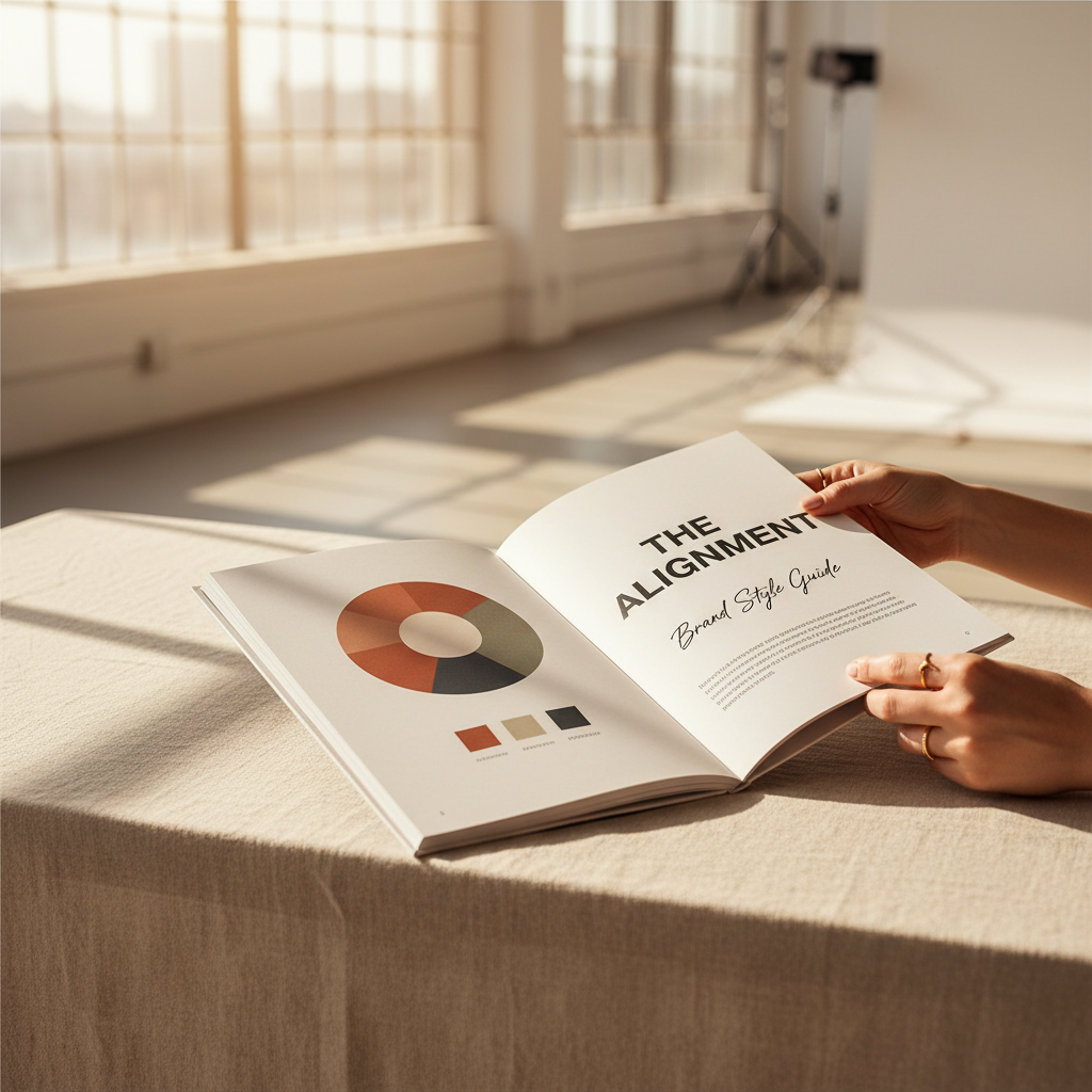
This practicality extends to every touchpoint where a customer interacts with your business. When a client opens a physical package, the textures and secondary patterns included in a comprehensive brand identity design create a sensory experience that builds perceived value. Similarly, a digital product or a PDF proposal must mirror the same level of care seen in past brand identity projects. To manage these variables, we provide a Brand Style Guide. This document is not a static souvenir of a completed project; it is a strategic roadmap for growth. It dictates exactly how to scale your visuals as you hire new staff or launch new services, ensuring the multidisciplinary creative services you have invested in continue to yield a professional return as your business expands across the Fraser Coast and beyond.
Why Small Businesses Often Get Branding Wrong
Many entrepreneurs fall into the trap of reactive design, where branding happens in stages rather than by deliberate decision. This often begins with a rush to launch, resulting in a DIY logo or a cheap icon from a generic platform. While these options are inexpensive initially, they rarely scale. A low cost graphic lacks the structural integrity to move from a tiny Instagram profile picture to a large scale storefront sign, often failing to resonate with a sophisticated audience.
This piecemeal approach leads to patchy branding. As a business expands, the owner adds a flyer, a website, or a uniform, but without a central strategy, these elements do not speak the same language. If you find yourself asking if a logo is enough, the answer lies in the friction caused by this inconsistency. A comprehensive brand identity design prevents the need for a costly, emergency rebrand in several years when your visual image can no longer keep up with your professional growth. By choosing multidisciplinary creative services early on, you treat branding as an investment in clarity rather than a decorative expense. It ensures that your past brand identity projects and future marketing efforts stay aligned, saving the significant time and capital usually wasted on fixing a fragmented identity later.
How to Tell if Your Current Identity is Holding You Back
Determining if your visuals are a roadblock requires assessing the friction in your daily operations. You may feel a subtle hesitation to share your website or embarrassment when handing over a business card that no longer reflects your professional quality. This usually stems from a patchy brand, developed in reactive stages rather than through strategic decision. If your Instagram aesthetic clashes with your physical signage, or you rely on generic templates that lack a local voice, your presence is likely fragmented.
Moving beyond the logo vs brand identity distinction requires a unified system that works as hard as you do. Reviewing past brand identity projects illustrates the clarity and resonance that professional multidisciplinary creative services provide. Investing in a comprehensive brand identity design replaces professional hesitation with the confidence needed to scale your business across Hervey Bay and beyond.
While a logo is the face of your business, it is the complete visual system that builds trust and recognition. Moving beyond a single graphic allows your brand to speak with a consistent voice across all platforms. If you want expert help creating a cohesive look, exploring our approach to Brand Identity Design is a great next step to ensure your small business looks professional, intentional, and ready for growth.
